Project 3
Mobile App Navigation
I led navigation optimization projects across three mobile applications (Bed Bath & Beyond, Overstock, and buybuyBaby), with a strategic focus on reducing interface complexity and improving product discoverability. By eliminating navigation-related friction points, these initiatives enhanced the user's ability to efficiently evaluate and purchase products with minimal UI obstruction.
Problem One
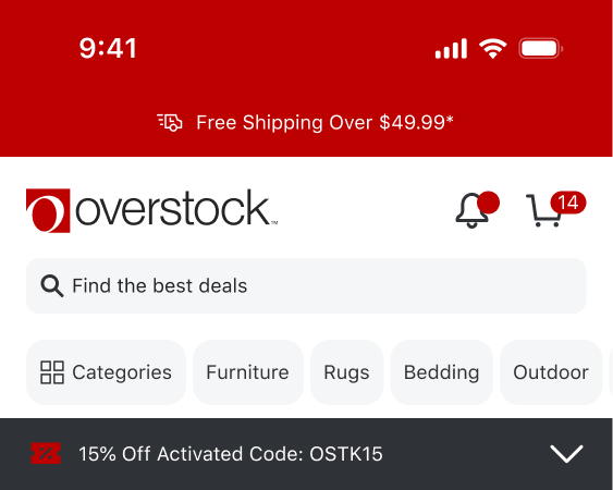
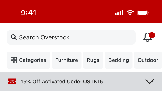
Through a comprehensive mobile app audit, I identified significant usability constraints stemming from inefficient interface layout. The prominent header and bottom navigation consumed excessive screen space, leaving limited vertical real estate for product displays and forcing users to scroll extensively to access desired content.
Research & Discovery
Due to budget constraints, we have operated with limited access to software and research tools, which required me to take a resourceful and adaptable approach. On the positive side, this experience strengthened my ability to develop alternative methods for gathering and analyzing data. I became highly effective at leveraging the tools available to us, including Google Analytics event tracking, AI, Apptentive feedback surveys and app reviews, and Google Firebase A/B testing.
Rather than relying heavily on upfront research, we adopted a “build-to-learn” approach, using iterative development combined with ongoing monitoring and optimization to inform decisions as we progressed.
Design & Iteration
Using Google Analytics 4 data, I analyzed feature adoption patterns to identify high-value functionality. I then mapped these insights to a navigation strategy, evaluating the optimal placement of key features in both top and bottom navigation structures, and developed designs that prioritized accessibility and usability.


Outcome & Impact
The A/B test validated the navigation redesign, demonstrating measurable improvement in conversion rates. Building on these results, we initiated a secondary optimization phase to test a persistent header implementation on high-value pages—specifically those in the critical purchase funnel where screen real estate constraints posed the greatest usability challenge.
Problem Two
We identified that the original navigation experience on the Product Details Page required excessive scrolling, which created friction in the customer journey. For example, when customers selected a product variation—such as a different color for an area rug—they needed to scroll back to the top of the page to view the updated main image and confirm their selection.
Our goal was to create a more seamless and intuitive experience by reducing unnecessary scrolling while ensuring that key product information remained above the fold to better support customer purchase decisions.
Design & Iteration
We chose to approach this initiative in two iterations to better measure and evaluate the impact of the new pricing presentation. The first iteration focused on validating that condensing the information and reducing the need for scrolling would not negatively affect performance. Through A/B testing, we confirmed that the streamlined layout was effective.
The second iteration introduced price variations directly within the option selections, since the primary pricing information is now positioned below the fold. We are still in the process of measuring the full impact and success of this update, but the early results are promising.
Outcome & Impact
This remains an ongoing initiative focused on evaluating and iterating across every page within the mobile application. The project presents several complexities, with the primary challenge stemming from one of our greatest advantages: maintaining a single native app code base across iOS, Android, and all three of our brands. As a result, we must approach updates thoughtfully and strategically to ensure that any changes deliver a positive impact across all platforms and brands simultaneously.
Have a project to discuss?
Happy to share more about my work or hear about yours.