Back to Projects

Project 4

Measurable Outcomes

The case studies below are a small sample of the data-driven work I've led—each one grounded in customer insight, validated through testing, and tied to a measurable business outcome.

I don't treat data as a reporting exercise; I treat it as a compass. Every project here started with a clear problem, was shaped by evidence rather than assumption, and was judged by results—not by how clever the idea sounded going in. That mindset also means I'm comfortable being wrong in public: some of my best outcomes came only after an initial approach failed and the data told me why. I'd rather iterate fast toward what actually works than defend a decision because it was the original plan.

What ties these projects together isn't a single skill set—it's a process: dig into the problem, form a hypothesis, test it, measure honestly, and adjust. The wins below are real, but so is the iteration that got me there.

Re-platforming a Third-Party Ecommerce Experience to a Native Stack

$2.1M/yr in contract savings · +40 pt improvement in page performance

Problem

Our web and mobile ecommerce experience ran on a third-party platform that was slow, inflexible, and limited our ability to track performance accurately.

Approach

We audited the existing experience end-to-end, defined a vision and roadmap, and designed a native replacement. From there, we led the migration of the full experience (web and mobile app) onto an in-house tech stack.

Outcome

The migration delivered faster page loads, more accurate end-to-end analytics, and a foundation that scales across other brands and platforms, all while eliminating $175K/month in third-party contract fees.

Homepage

Desktop
Performance 5386
Mobile
Performance 3665

PLP

Desktop
Performance 3582
Mobile
Performance 3050

PDP

Desktop
Performance 5462
Mobile
Performance 2957
3rd-party Native Scored out of 100
Removing Forced Sign-In for Guest Order Tracking

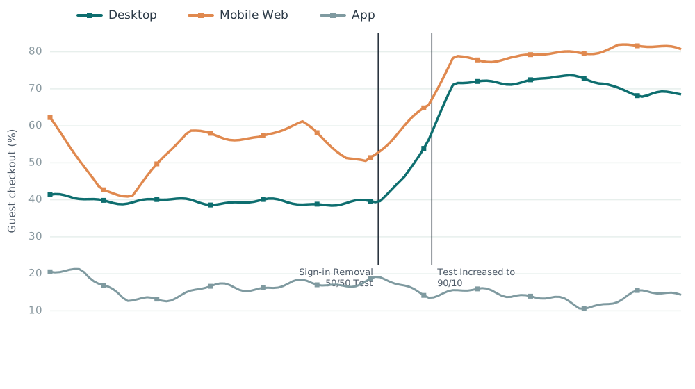
Friction eliminated for 70% of guest orders

Problem

After the shift to guest checkout, roughly 70% of orders were placed without an account, yet customers still had to sign in or register just to track a shipment.

Approach

Product and UX partnered on an end-to-end audit of the post-purchase experience, then redesigned the tracking flow to support PII-safe order lookup with no sign-in required, across both web and app.

Outcome

Guests gained direct access to order status, support calls dropped, and the post-purchase experience finally matched the company's guest-first strategy.

Line chart of guest checkout percentage over time for Desktop, Mobile Web, and App. After sign-in removal, Desktop rises from about 40% to roughly 71% and Mobile Web rises to about 80%, while App stays low and flat.

Validating “More Options” Badging Through A/B Testing

+75 bps CVR · ~$132K annualized

Problem

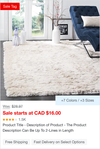
PLP product tiles displayed a single consolidated count of variant options (e.g., “21+ More Options”) without breaking out what those options actually were.

Approach

We designed an A/B test to measure click-through and conversion impact on PLP tiles. Control kept the consolidated count (“21+ More Options”); the test variant broke this down by attribute (e.g., “+7 Colors / +3 Sizes”).

Outcome

The more detailed treatment drove a 75 bps lift in conversion rate (~$132K annualized) — replacing a years-old assumption with real evidence.

Control PLP product tile showing a single consolidated '+21 More Options' badge.
Control — “+21 More Options”
Test variant PLP product tile showing an attribute breakdown '+7 Colors / +3 Sizes' badge.
Variant — “+7 Colors / +3 Sizes”

Removing Friction from Lead-Gen Pop-Ups

12% increase in new customer acquisition generating an additional $2.4M annually

Problem

Customers consistently flagged frustration with sign-up modals — particularly being prompted to join our email list before they'd even browsed enough to know if they wanted to. Worse, once dismissed, the modal was gone for the session, leaving no way to sign up later if they changed their mind.

Approach

We iterated twice to solve this.

First attempt: Since an email capture field already existed in the site footer, we tested simply turning off the modal. Email capture dropped sharply — the modal, friction aside, was still doing real work.

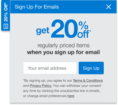
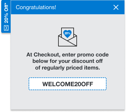
Second attempt: We set out to design something with less friction than a modal but more persistence than a footer field — visible and accessible any time a customer decided they were ready, not just on first load. We landed on a collapsible tab on the right margin: it would slide out after 10 seconds on-site, and if dismissed, it collapsed into a persistent tab the customer could reopen anytime, including in future sessions. On sign-up, the promo code was delivered both via email and instantly within the current session.

Outcome

The new approach drove a 12% increase in new customer acquisition, generating approximately $2.4M in additional annual revenue.

Lead-gen sign-up flyout offering 20% off when you sign up for email, with an email address field and Sign Up button.
Sign-up flyout
Success state flyout reading Congratulations, with the promo code WELCOME20OFF to enter at checkout.
Success state with promo code

Have a project to discuss?

Happy to share more about my work or hear about yours.